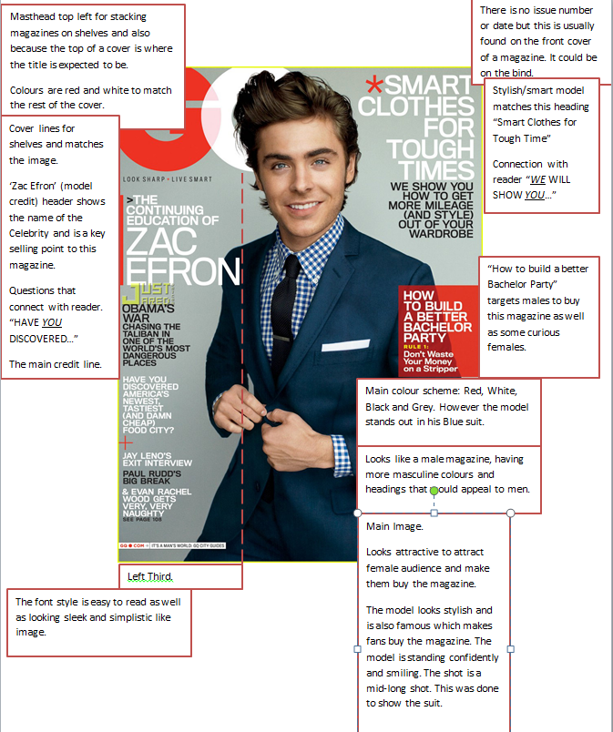
Wednesday 24 October 2012

Conventions of a Contents Page

The typical conventions expected to be found in the contents page of a music magazine.

Tuesday 23 October 2012

Focus group questions and answers

Q1) What music magazines do you read? And what genre do they fit into?

Q2) What attracts you to buying a magazine?

Q3) Do you think digital downloads should replace paper magazines?

Q4) How important is the price of a magazine to you?

Q5) Do you think that buyers should have more input into what is featured in specific magazines?

Q6)  What features are essential to you to buy a magazine?

Q7)Do you think genres are too generalised?

Q8)What would you change about music magaiznes?

Q9) Do you think there is a stigma/stereotype to the people that buy music magazines?


Tuesday 16 October 2012

Front Cover, Contents and Double Page Spread LIIAR Analysis


Institution

Haymarket is a large (ish) company that produces a large variety of magazines but aren't too popular. It mainly tends to publish sports magazines such as "Inside United" and "Champions Magazine". Haymarket also produces sports brochures.
The X factor magazine is published by Haymarket Network on behalf of Fremantle Media and Syco Entertainment. 


Front Cover

The front cover image is very posed. It's a mid shot and the model Danni is smiling. This shows that it's a happy issue in some ways and there's no shocking news. Her mischievous pose matches that captions "Watch out, it's Danni". Danni is obviously the headline and the key selling point to the magazine as she was celebrity and at the time she was an X factor judge. 
She obviously been done up to look glamorous and been airbrushed slightly but this in someways represent the glamorous and expensive feel to the magazine.
The design of the magazine has used pink black and white and then a little yellow on the plug and menu strip.
The pink can represent that this is a female magazine and also that there is a female model on the cover can match with this.
The title 'X magazine' is in the Top Left corner which is where you would expect to find a title. The 'X factor' logo is easily recognised which is why the logo doesn't need to be particularly large.
There are lots of pictures on the front cover. This is done because people don't necessarily read all the different headlines on the cover so if there is an image of someone that you recognise (for example Katy Perry is on the left third)  you might buy it. In this magazine there are several artists put on the cover at attract the attention of the buyer.
          
The font is in an easy to read modern style. Some fonts are different than others. The heading 'DANNI' is different to the text 'The stakes are higher than ever". This is because the heading 'Danni' is meant to stand out more. Some of the text is white behind a pink highlight. This could be done because the creator wanted to even out the colours used, and also because black or white just behind the image of Danni would not have showed up as much.
There's font generally everywhere on the cover. This can give a 'Crammed full with Gossip' feeling to magazine as the magazine has used nearly all the typical conventions you would find on a front cover:

  • There is a plug which says 'Win tickets to the live show'
  • A left third with other important headlines
  • A skyline selling line saying "Music, Stars, Style"
  • Images
  • Menu strip at the bottom of the cover.
  • Text in different fonts/colours
  • A mast head
  • A secondary lead
  • A bar code & price
  • A plug ' win tickets to the live shows '

The Ideology behind the magazine is more than just the music. This is because the X factor is a show and there's more to it than just music.  Things like the gossip amongst the contestants, the celebrity life style of the judges and the information behind the making of the show.
The music that is sung and played on the X factor is a variety of styles so there is no fixed genre for the magazine. However it certainly does seem to stick with Mainstream Pop music.
In the front cover the pop genre can be shown as pink and white seem to have a pop feel whereas if X factor where more into Rock music the colour scheme would be different and so would the celebrities on the cover.


The magazine shows that it's about music since all the people on the front cover are Artists that where at the time currently in the charts. Having said this there is also a caption on the top right of the magazine which says '99 ways to get celeb style' which shows that this magazine also has fashion in it. I think because Danni Minogue is in the Front cover (and she is a female icon) it targets females. Also because boy band JLS are on the cover and Take that it's meant to attract the female audience more.

To the target audience the magazine is simply not just about the music. The target market for the magazine would be for people that watch the X factor.
The front cover does not ultimately have much of a music feel about it. It has more of a gossip feel to it. The music genre has no real representation since it looks like a gossip/style magazine although music artists are featured on the front.

Contents Page


 On the left quarter of the magazine there is the editors notes. It is a typical convention such as a logo and issue number/date in the top left corner.
On the bottom strip there are pictures of the contestants and a cross every time someone has left the competition. This will appear in every issue and so keeps consistency to the magazine.
There are various different headings with different colours in the background of each one. The colours can represent how important each feature in the magazine is or it can represent what the headings are for.
For example:

  • '110%' not that important as it's in blue, a fairly mutual colour although it can be linked with boys. Because 2 other headings are blue it does not stand out as much,
  • 'Features' in red. Red can represent 'hot' news. Because features is the important part to the magazine this is why it was been featured red. To stand out,.
  • 'Style File' in pink shows that this is the section for girls. The headings underneath are fashion related.
  • 'The final 50 ' in a yellow can represent gold and winning. The final is the most important part to the whole show. It has celebrities names in bold underneath to stand out.
Because of these different sections it makes the publisher able to appeal to target audience.

The language in the contents page is similar to that in the Front cover because they are from the same magazine.
There are images used on the Contents page too. The image used on in the editors notes is normal and typically found on a contents page.
The contents page has something for everyone in terms of gender. The different headings shows a variety of whats in the magazine.
The images of JLS (The four men) is larger than the rest of the images  to show that it's one of the main articles in the magazine. They look stylish which is meant to give the magazine a stylish feel.
The band can connect with both the male and female audience. Female because they can be attracted to them or male because men could try to base their style similar to them.
 The image used of Kylie Mingoue is used to match with the 'Style File' heading. She is represented as being stylish and glamorous and an icon to the female readers. They are supposed to look up to her and like the fact that Kylie has been chosen to represent the 'styke file'.

The page layout to the contents page is easy to understand and goes into/uses the expected conventions. The text chosen is easy to read and has a modern feel to it. It shows that this is not an academic magazine or the text would have been in a more old fashioned style. The colours are stylish and bold which can tell you that the magazine is stylish, hip and on trend and also that the magazine is similar to the on trend extravagant X factor show. Some the words are in bold to stand out more. This is not sell the magazine even more by putting the names of celebrities featured in the magazine to appeal to the audience/ target market and persuade them to buy the magazine even more.

The music genre is represented as being fun and exciting and matches the pop style which the X factor sticks to. The colours are bright which is the colours I associate with pop music. If it where a rock magazine, the colours would have been much darker.


 Double Page Spread

In the double page spread there is an entire page taken up with an image of Ellie Goulding. She is lied down and looks relaxed . Next to her there are some weights which suggests she's just been working out./doing exercise.
Ellie represents the music theme of the magazine as she is an artists currently in the charts whereas the weights do not. This is unexpected for a music magazine to do a Music and exercise article.
The whole of the right page of the double page spread and part of the left suggests that Ellie is important and her image deserves most of the double page spread.
The mast head 'Going for Goulding' is a play on words as it means 'Going for gold'. The title then makes the image understandable as it suggests training/ exercising will make her win gold. The gold however can mean a #1 single.


The colour of the title is in pink. This  shows that this article is mainly for girls. The use of the colour pink can also suggest that Ellie (the model) is girly and feminine behind the exercising.
Ellie is still posed and made to look glamorous despite the fact that the article is about exercise and music.

The image of Ellie is used show that this is a pop magazine as Ellie is a pop artist. The text colour and font gives ideology that this is a pop music magazine. I think this because:
  • Pink is a pop music colour ofter found on Album covers and other music magazines
  • The font is modern which suggests that this is a up to date current magazine which is a lot like the music industry that is constantly changing and presenting new songs and artists.
  • There's not too much text as too much can seem over whelming. 
 The clothes that Ellie is wearing can also show that this is a pop magazine as they are bright colours and the outfit put together is very stylish. Furthermore it matches the sports theme as there is a 'puma' sport ware logo on a sports jacket.
The message is that this is Ellie, a pop star that's here to talk about more than her music.

The double page spread can appeal to its audience more because it has a 'Style File' plug.
This is mainly targeted to woman because it's pink and also because typically the audience would associate Style with females. The text is pink therefore appeals to the audience because this article is for females. The fact that Ellie a current artist appeals to the audience as she is the key selling point to the article.
The genre of the magazine is still represented through Ellie as being pop.


Monday 15 October 2012

My College Contents Page & Front Cover & LIIAR Analysis


Liiar analysis.

I chose the colours purple and light green because I felt that they were suitable for a college magazine because they are unisex, match a college theme and also are similar to the colour scheme my college has.  I chose this picture of my friend Haleema because I felt she suited the stereotypical model for a college magazine front cover (Pretty and smiling in some educational background).  The image I have chosen looks like Haleema is at College as you can see she is sat at a desk.
This suited my theme and matched what you would typically find in the front cover of a magazine. I have used various conventions in my front cover such as a plug labelled ‘Spring Break Issue!’ and put headings on both side of the page.  I did this because during my research into looking at other college magazine front covers I found that post had headings on either side. 
 My heading if fairly large because again this is what size you expect to find on a front cover and it is in the Top Centre which is also where you would expect to find a heading.

On the bottom third of my magazine I have a headline with other pictures. This is because I had to include lots of original images and I thought it wouldn’t make my front cover seem so boring. The general ideology behind my magazine is that this magazine is targeted to college students. It targets people that are interested in getting higher grades within their education.
I think because my model looks like shes been working hard it gives off the hard working educational connotations. The headlines are meant to connect with the audience and appeal to everyone. The front cover matches the typical conventions so it’s not meant to confuse. I’ve addressed my audience through my plug and exclusive pictures. There is no institution to my magazine since I made it.
 The Audience targeted for my magazine would be students, both male and female. So ages between 16-18 and even teachers. Haleema my model for the cover is represented as being hard working, a student, happy as she is smiling in the image and basically the type of girl that everyone knows. The front cover is meant to connect with the buyers of the magazine so that they see the front cover and automatically understand what the image means and therefore what the magazine is all about.


My Original Images
 
These are the original images that I took for my magazine.
I did not put some on because I felt that they where not good enought and others where not put on because I didn't have enough space.  


**19/12 After studying Media Studies longer now I realise just how bad the front Cover was.
 You can barely read the text and the image is blured. This preliminary task has helped me realsied what looks good and bad in a magazine.


Thursday 11 October 2012

Mood Board

A mood board for my college magazine

College Magazine Initial Ideas

Front Cover Draft

Contents Draft
Here you will see the draft for my College magazine that I did on the computer and hand drawn. I made some changes to my plan such as using on model instead of 2 on the front cover. And making the bottom third of my front conver straight instead of slanted. 

3 College Magazines Front Covers

2
1
3
The First magazines picture if of a girl smiling and looking happy. The headlines on the magazine are not boring headlines. They don't really seem to be about work too much as the reason why students by the magazine is to relax. It has a shocking headline such as 'She's 15 & Pregnant' but also articles on Health such as 'Smoking Saliva'. The colours of the text all match and also the font is all the same apart from some is in italic. This makes the Front cover look easy to read and young in some ways.  There is a title at the top of the page in the page which is where you would expect to find the title to the magazine.

The second image is of 'Mike Posner' a famous rap artist. Because he is on the front of the cover it makes him connect with the younger audience more and persuades them to buy the magazine. Yet again there is a shocking  headline 'I slept with my professor'. There are lots of headlines on this issue. Some are abound education and college whereas others are about the more social side to college. This mix of headlines makes the magazine seem educational but interesting and fun.
 
The third magazine front cover has a girl at the front which shows that this is for the college age group. This issue is more about education and working hard. It has headlines such as 'why now is the time to invest in college education' and no really gripping headlines.


Wednesday 3 October 2012

Kerrang! Magazine Front Cover & Contents Page Analysis


Front Cover

The main colours in this magazine are black, white and yellow.  Yellow being the main colour shows that it’s quite a positive issue despite Hayley’s quote. The caption “I have nothing left to prove” matches the image as she looks unhappy. The shot is a mid-shot so that people can see her pose and body language. The majority of the information is all in the left third of the magazine.
At the top of the page there is a competition to win VIP tickets. This could suggest that this is an important competition which is why it is in the top of the title. ‘Haley’ and ‘your’ is highlighted in yellow. This could be to make the reader and Haley connect and make the magazine appeal to the buyer more. On the Left third there are other features to the magazine such as ‘Bullet for my Valentine’ also in yellow and black and white. Generally the main names on this front cover are highlighted.  There is also a plug on this magazine which gives off a special vibe to the image. “Huge 7-day guide” grabs your attention. At the bottom of the page there is a 'PLUS!' section. It gives an 'even more' sort of feel to it. That this issue in particular is crammed with articles/posters and worth your money. There is also some text at the top of the bar code. This is Kerrang trying to fit more information onto the cover.

Kerrang is published by Bauer Media Group which is a multinational publishing company with an average of 38 million magazines a week. Kerrang is arguably the best rock magazine available in the UK. It’s certainly one of the most popular and frequently bought amongst teenagers that are into the rock/indie genre.  Although Hayley Williams is the headline in this issue, Kerrang has a wider variety of features as it has a popular music channel and a website. Obviously this magazine is mainly targeted to those that particularly like Paramore.

The general Ideology behind this cover is that Hayley is the headline to the magazine. "Haley answers your questions" is the main feature, hence why this is on the front page.  Because of this, this makes Hayley the key selling point to the magazine.  A music fan would browse magazines in the shop and notice that on this particular issue Hayley Williams is on the front cover. This would be a good enough reason for someone to buy this magazine because she is a music icon and at the time her band where very popular. This is a good representation of the idea that putting celebrities on the front cover of a magazine encourages people to buy it.  Furthermore the gripping headline "I have nothing left to prove..." encourages you to buy the magazine even more. What does she have to...or have not to prove?
The Audience is quite small, Kerrang is only reaches to certain group of people. Those into rock/indie/alternative however this is considered one of the best rock magazines. The 'poster special' box is a key selling point. This is because teenagers that read this magazines fill their walls with posters from each issue. Now a typical reader would look at this magazine and think "Ooh more posters for my room". This may sound unbelievable but I once bought a £2.50 magazine because it had an A3 Tom Daley poster inside. Then again it has been put on the front cover so it proves that this is a selling point.
Hayley can engage with young female readers as well as the male audience that might find her attractive. The price to the magazine is £2.20. This may be a little pricey since you can buy a 65p 'pick me up' magazine however as i said before, Kerrang reaches a niche market, and you get  what you pay for in the issue. It's unlikely you'll find something in the magazine you weren't interested in. It certainly covers the main gigs and is a highly recognised magazine. It's quite respected within the rock music community. Hayley Represents rebelling. The colour of the magazine have a dangerous feel to it as yellow and black can be linked with hazards and something that you can't cross. This is why 'Security' is written across her top. But because Hayley is in a careless pose as mentioned before it gives you a reason to read the magazine.
The language is clear as the front cover has a rebellious sort of tone to it. The smashed title and the careless pose by Hayley say that she’s breaking security. She has security written across her top which shows that she doesn’t care. Hayley dominated most of the cover and is the key selling point to the magazine as at the time this was published, paramour (Hayley’s band) and just became very popular in the Music Scene and about to go on tour.  
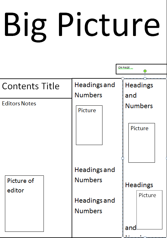
Contents page
The main colours to this contents page are Yellow, Black and White. This gives that rebellious, hazard feeling to the magazine. The contents page has the typical conventions. There is;
  • The title 'contents'
  • Authors Notes
  • The title of the Magazine somewhere to be found on the contents page
  • Main feature (This time it is 'Bring me the Horizon')
  • Features with Page numbers in numerical order
  • Various pictures
  • different fonts and colours
  • Issue Number
The picture at the top of the page takes up most of the page (half). The image is not posed and is sort of free. I like this because I think it would connect with the reader better and in a way you could pick up more from it. Since Kerrang attracts a young audience and the people in the image are young then it makes the image believable and appealing. What I notice about the contents page is that it has various headlines in black and yellow. 'Feedback', 'news', 'swag', 'live reviews', 'features', although it is at an early stage, I will probably use something like this in the magazine that I make.


There is a simple background that is white. This is important because the text on top has to be readable as that's whats important to the magazine.  The page numbers are easy to understand. Next to a heading such as 'Bring my the horizon' there is a number which represents which page that article is on. There doesn't need to be page numbers  because of the typical conventions that you would find on a magazine you know that the numbers represent that page numbers. The magazine is represented as being a a full issue with lots to see as it seems that the contents is crammed with headlines/titles.

The institution is the same as before...

Kerrang is published by Bauer Media Group which is a multinational publishing company with an average of 38 million magazines a week. Kerrang is arguably the best rock magazine available in the UK. It’s certainly one of the most popular and frequently bought amongst teenagers that are into the rock/indie genre. Kerrang also has a Popular website, TV music Channel and Radio.  


Tuesday 2 October 2012

Front Cover Features

GQ Magazine


This is my front cover analysis looking at the key features to a front cover of a magazine.