Thursday 31 January 2013

POP IT! Website :)

The pop it! Website
Here is a draft of the web page for my music magazine. I have features Lucy on the front and the logo. The website is important for any magazine as it's a way of connecting with its readers as well as boosting sales.

I used the other 2 websites as inspiration. I realised it's important to have lots of images. And also to use bright and different colours. My website has no advertisements because they are annoying :)

Double Page spread finding

I like the layout of this Double Page Spread. I think it's quite different to other double page spreads and it's heavy in text but I think it works. If I wanted to recreate this I would have to take some Full Length shots which would mean a Re Shoot.

Wednesday 30 January 2013

Analysising my contents page..

I haven't finished my contents page yet and I would like to make some more changes later on.

Thursday 24 January 2013

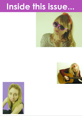
Contents page draft

I am working on my contents page. I am testing different things to put into the bottom right of the page.

Draft For Contents Page

A really basic draft for my contents page. I am thinking about using the bumpy border.

Tuesday 22 January 2013

Contents Page Draft

Here is a draft for my contents page. The purple square will be a large image.

Friday 18 January 2013

Front Cover Analysis

Drafts

This first image is a digital mock of my contents page which i did using photoshop.
I changed quite a few things later on but it helped acting as a template whilst creating my contents page.
After feedback from my teacher I decided to draw out what I wanted my front cover to look like. I printed out the image in black and white and drew on the plugs/masthead.
This helped me produce my final front cover.
I have written "I have made various changes after feedback, i've realised that what attracts me to a magazine is a busy, fun, exciting page! So my my magazine should do just that".
This is a hand drawn draft for my contents page. It is quite messy but it was the first draft of the contents page that I produced.
This was another draft I produced whilst making my contents page as a test to where I wanted to place my images.

Tuesday 8 January 2013

Feedback Assesment

I agree with what people have said about my front cover and I think that the right hand side of my front cover is bare and needs more text. I'm glad people can see how much effort I have put into my blog.:))

Peer Feedback

Charlotte Medhurst

I really like the layout of your blog, its clear and easy to look through and the polls on the side are a brillaint idea.

Its a good front cover, a nice layout and the colour scheme fits well with the genre.
I think its a really good photo as well, with an effective use of lighting.
The masthead is catchy and draws attention well.
Looking on draft 3, theres no price issue number.
The only criticism is that the photo of Justin Bieber looks a little blurry.

Peer Feedback: Ben Naylor

Your blog is so exciting and fun, it really looks like a lot of effort has gone in to the making of it. It is clear that you have really tried your best to create an interesting thing to look at. The bold designs and work which is included really makes people want to read and look at what you have done.

Your final front cover is very appealing to your selected target audience and would have them head over heels for it! The colours conspire to overwhelm the back ground of the model which personally, I think I would have removed! Although I like your front cover, like I said I would have removed it as it's not perfectly white and makes it look less professional.

Overall I really like your blog and front cover!

Peer Feedback: James Bruce

I love your blog. The use of title and shot testing is brilliant, the amount of effort you have put into testing each variable of your front cover is clear to see, and allows anyone to draw upon your ideas with ease. You are clearly a very colourful person as i plain to see when you look at the ammount of colours and bold designs that you have incorperated into your designs.

I think your final front cover is very well designed and the final product is very realistic however I feel that there is a lack of information on upcoming articles other than that there is nothing to coment on, it is a perfect finished product.

Peer Feedback : Liam Darley

Overall Assessment : your blog is extreamly detailed and shows your genre clearly. your posts could do with ordering though. all the posts are up to date and are in great detail.

Stregnth of front cover : The front cover is clearly laid out in your genre it suits convention. the image is well framed and shows your artist clearly.

Improvements : you could add more detail on the right hand side its looking a little bare.

Peer feedback: Oliver Wright

I like your blog overall because you have put a lot of posts onto to which shows that you have taken a lot of time to make it.
          The images on your front cover are good and make it look like a real magazine that you might see in a shop however i thyink there is too much purple at the bottom of the page. I think that in your first draft the amount of purple was better. Along the right hand side of your cover it looks a bit bare so i think you should put some writing or the plug there. Your plug is very good, i like that you have used different colours for the writing on the plug because it makes it look more like a real magazine plug.