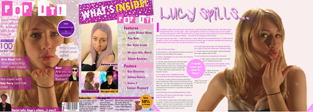
Language - Front Cover - The photograph on my front cover is composed so that it gives of a flirtatious, girly feel. It is a medium close up which sticks to conventions as most front cover images are medium close ups. The connotations of the front cover image is that Lucy is obviously blowing a kiss. It gives off the girly pop star image and shows that she is very much on the pink and fun side to pop music. The masthead shows that the magazine is clearly a pop music magazine and has a fun twist in the name. The position of the image is centred as this makes the magazine stick to conventions. The connotations of the font is easy to read. The font isn't expensive looking or posh looking. It targets my younger audience. The colours stick to the theme. The colours pink and purple are colours typically associated with girls. This should attract my audience and make it easy for them to identify that this magazine is targeted towards them. I have used conventional elements such as mastheads, plugs and pull quotes.
-Contents Page- The images on the contents page again show off the pop music feel. I especially feel that the backgrounds I have used really shows off the pop feel. As the font is the same as the front cover it provides continuity within the front cover and contents page. The font is easy to read, an interesting and modern style that to me as a comic feel about it. It doesn't break conventions and the connotations to the font is young and fun. The colours of the font I have used on the front cover is either black or pink. It leans more towards a female audience. I chose to use different coloured fonts because it makes the magazine contents page have a variety of different colours, therefore making it appear less boring and also for example... putting pink text on top of a yellow background wouldn't make it as easy to read. The background is glitter which gives off a luxury vibe to the magazine but also a girly feel.
- Double page spread- The image on the double page spread is similar to the image on the front cover. This was done on purpose to make both the front cover and double page continue the theme. This case being a flirtatious kiss. The large title of the article 'lucy spills' is joined up and i felt it had a flirtatious feel to match the image. The colours that I used i felt showed that it was a girls magazine. When associating kissing with a colour, I initially thought of the colour red. However I found that this was too mature as a colour to use to i decided to use pink instead.

No comments:
Post a Comment