 |
| Behind the scenes of teh test shoot |
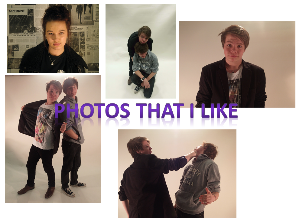
I like the Mid shot of Daniel in image 3 and I feel that this is the most appropriate image to use for a front cover because it matches to the typical conventions you would expect to find on a magazine front cover. In image one I also like the theme to the image which was an indie style shoot. My model Alex captures the theme with her pose, clothes and the background. It defiantly matches the mise-en-scene. The long shot in image 4 sort of worked. It think I will use a long shot inn my double page spread. Th test shoot has made me realise that for my magazine, throughout the pages I should stick to one consistent style of lighting but use different angles and shots. Image 5 was really just messing about and trying something new. The image angle looks different but I think it sort of works.
I don't like image 6 on James as it's bluured and also isn't centered or positioned right. The image is just bad.

 |
| images 6 |
No comments:
Post a Comment