
Thursday, 21 February 2013


Wednesday, 20 February 2013
New contents page drafts
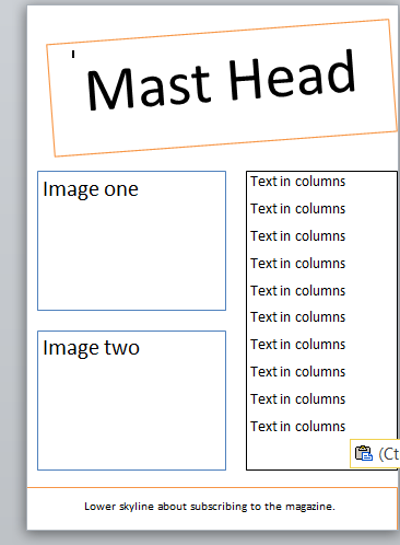
So i've made some new drafts for my new contents page. I will feature either one or two images on it. I think that one image would look better than two however i am worried that this might break conventions. Also I had issues with taking images as i dont think that my images are that strong. Never the less I will try my contents page with twm images and one when the drafts become more advanced. And if I am unsure will ask my class mates to do a survey. 

Posters!
Part of my research for my magazine involved looking at different posters found in pop music magazines. I hate noticed that the posters will have a bright and colourful background, feature the magazines logo and have the name of the artists in colourful text.
The first image of JB from JLS has an colourful ornage background and features the name and logo.
 I hate noticed that the background is only 2 colours and this is something that I took into consideration when making my poster. The same applies to the other 2 posters. They both stick to 2 colours. White and purple or grey and pink.
I have as you can see tested some colours. I like the indea of using white with another colour. I wont change the colour of my logo because i dont think that i need to.


The first image of JB from JLS has an colourful ornage background and features the name and logo.

I have as you can see tested some colours. I like the indea of using white with another colour. I wont change the colour of my logo because i dont think that i need to.


 |
| My own version of a Poster I have tried to stick to the 2 colours that I found in my research however I decided to make the logo much larger than usual. |
Teacher Feedback
After Feedback from my teacher I have started to completely redraft my contents page. The process has been slow since I am also trying to meet deadline for my double page spread but I am unsatisfied with the contents page as i think it is quite poor. I feel that it looks too basic and generally unprofessional. After my research and looking at myt peers contents pages I feel that mine could be much better. I agree with all the feedback my teacher has posted.
Tuesday, 19 February 2013
peer feedback Tom
you have really thought out your layout for your contents page and have positioned things well, you have also selected the colours really well and they work well together.
you could improve by maybe including more infomation because it looks really basic
you could improve by maybe including more infomation because it looks really basic
Peer Feedback
The colours used are very vibrant and this makes it eye catching and interesting for the reader. The way that one of your models in the bottom image on your contents page, is making eye contact with the reader means that it engages the audience, and looks good. To improve it you could perhaps add more text, and more blocks of text in different places on the page.
Subscribe to:
Posts (Atom)