Friday, 23 November 2012

Something I found...


I just found this magazine front cover and I absolutely love it. What I like about it so much is that there are so many different images on the front cover it's given me some ideas about including pictures of posters that would be featured in the issue. This would allow me to better match to the pop music genre by including otehr pictures of artists. With this I can include various different location shoots and artists. mI have an idea now of including a boy band within my coursework.

Photoshoot chosen image

I have chosen to use this image for my front cover. I have chosen this because I think it matches to the pop theme to some extenet. I am aware it doesn't scream mise-en-scene or the pop theme. I like how the image is centered as well as having a pop star flirtacious feel to it.

Thursday, 22 November 2012

Test Shoot Photos

 
Behind the scenes of teh test shoot
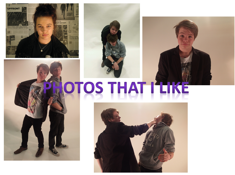
I liked these images because I felt that they where not blurred and generally look like good images. I like the lighting on images 3, 4 and 5 really worked. In these images I only had the right and Left light on. Image 2 had all 3 lights on. In some ways I like this image as it makes the image look for bright but I think just having 2 lights gives a better effect.
I like the Mid shot of Daniel in image 3 and I feel that this is the most appropriate image to use for a front cover because it matches to the typical conventions you would expect to find on a magazine front cover. In image one I also like the theme to the image which was an indie style shoot. My model Alex captures the theme with her pose, clothes and the background. It defiantly matches the mise-en-scene. The long shot in image 4 sort of worked. It think I will use a long shot inn my double page spread. Th test shoot has made me realise that for my magazine, throughout the pages I should stick to one consistent style of lighting but use different angles and shots. Image 5 was really just messing about and trying something new. The image angle looks different but I think it sort of works.

I don't like image 6 on James as it's bluured and also isn't centered or positioned right. The image is just bad.


images 6

Wednesday, 21 November 2012

Indie Style Test Shoot

Alexandra my model :)

The Set
I tried out doing a front cover mid shot to an indie style theme. Between a pop and an indie theme, I felt that the pop theme worked better.

Tuesday, 20 November 2012

Brief

The Brief is to create a front cover, contents page and double page spread for a new music magazine. 
All my image and text MUST be original as well as using at least 4 images in my final piece. 

Tuesday, 13 November 2012

POP MAGAZINE DRAFT: Front Cover, Contents Page and DP spread

Contents Page

Front Cover
double page spread
Breif mock of the style magazine that I want

Ideas for Photo Shoot! Pop Music Magazine!

I want to stick at the basic fun pop music magazine feel. I am thinking about linking the theme to sweets and candy. I like this image of lady gaga as the colour pink has been used. This would be the type of image I would use on the front cover to my magazine. I think that a black and white image with pink in the lips and hair would be a good idea. Then I could use photo shop to get the pink on.

Looking at poses to magazines, I want a celebrity style confident pose. I want my model to look glamorous and a fashion icon. I am not going ti use any props in particular. But I will chose an outfit and do make up that match the theme. For my idea I am just going to experiment different poses, angles, shots and colours to see what works best. One thing I am sure of is using the white background at my college. For my contents page i might include images from a different photo shoot but I can get to that later.