Tuesday 19 March 2013

EVALUATION Q2: How does your media product represent particular social groups?

I have decided to do part of my evaluation on go animate because it is much more fun.

EVALUATION Q2: How does your media product repres by s0014522 on GoAnimate

Animation Software - Powered by GoAnimate.

My product represent the social group girls between the ages of 11- 16 interested in pop music.It does this by having colours typically associated with girls.
Looking at the images below it shows examples of where I have used colours to represent the social group/stereotype.
 My magazine represents stereotypes in pop music artists too. Looking at how Lucy has been portrayed throughout the magazine is flirtatious. Flirtatious images and poses.
The image I have put in my magazine also make Lucy look very girly. This is backed up again by the colours that I have used. The magazine makes Lucy (the pop star) look glamorous through using the glittered background.
I think that the media product in general represents what people around the age are interested in. Things such as fashion, pop music and gossip. 
Looking at the example of my target audience it shows that she is interested in pop music and this has been met in my magazine.

I don't like the idea of stereotyping the audience too much but I'm fairly sure that the example of my target audience goes towards most girls at that age. If I was 11 I would by this magazine (providing that I had the money)

Q3: How does your media product represent particul by Isabel Worrell on GoAnimate

Pop It discussion by Isabel Worrell on GoAnimate

Animated Presentations - Powered by GoAnimate.

EVALUATION: Q3 What kind of media institution might distribute your media product and why?


Monday 18 March 2013

EVALUATION: Language Analysis of my Magazine


Language - Front Cover - The photograph on my front cover is composed so that it gives of a flirtatious, girly feel. It is a medium close up  which sticks to conventions as most front cover images are medium close ups. The connotations of the front cover image is that Lucy is obviously blowing a kiss. It gives off the girly pop star image and shows that she is very much on the pink and fun side to pop music. The masthead shows that the magazine is clearly a pop music magazine and has a fun twist in the name. The position of the image is centred as this makes the magazine stick to conventions. The connotations of the font is easy to read. The font isn't expensive looking or posh looking. It targets my younger audience. The colours stick to the theme. The colours pink and purple are colours typically associated with girls. This should attract my audience and make it easy for them to identify that this magazine is targeted towards them. I have used conventional elements such as mastheads, plugs and pull quotes.

-Contents Page- The images on the contents page again show off the pop music feel. I especially feel that the backgrounds I have used really shows off the  pop feel. As the font is the same as the front cover it provides continuity within the front cover and contents page. The font is easy to read, an interesting and modern style that to me as a comic feel about it. It doesn't break conventions and the connotations to the font is young and fun. The colours of the font I have used on the front cover is either black or pink. It leans more towards a female audience. I chose to use different coloured fonts because it makes the magazine contents page have a variety of different colours, therefore making it appear less boring and also for example... putting pink text on top of a yellow background wouldn't make it as easy to read. The background is glitter which gives off a luxury vibe to the magazine but also a girly feel.

- Double page spread- The image on the double page spread is similar to the image on the front cover. This was done on purpose to make both the front cover and double page continue the theme. This case being a flirtatious kiss. The large title of the article 'lucy spills' is joined up and i felt it had a flirtatious feel to match the image. The colours that I used i felt showed that it was a girls magazine. When associating kissing with a colour, I initially thought of the colour red. However I found that this was too mature as a colour to use to i decided to use pink instead.

Wednesday 13 March 2013

EVALUATION:Q6 What have you learnt about technologies from the process of constructing this product?


(The video in the powerpoint doesn't work :( .... so here's a link)


A typical process would be working around a main image. I think it's important to have a plan and various drafts before starting the work. I have learnt that not understanding how to use a certain programme can hold you back a bit so it's important to take time to understand how to use the programme. Also it is important to take the advice given by teachers and ask for help.

If I where better at Photo shop I would of edited all the images better off. I would have given Lucy a better coloured hair that fitted to the pop genre more. Probably pink or purple. I didn't do this as I felt that putting an image of Lucy with dodgy hair editing would make the front cover look much less professional. I also would have added more professional looking text to the whole of the magazine.

Tuesday 12 March 2013

EVALUATION: Q5 How did you attract/ adress your audience?


EVALUATION: Q5 attracting the audience from IsabelWorrell

Slide 2 (  a part got cut off at the bottom. It says that having a subscription keeps my customers coming and is a way getting more issues out there. It would also cut the costs of getting the supermarkets to supply my products)


EVALUATION Q4: Who would be the audience for your media product?


1.Who would be the audience for your media product?
PowerPoint and video for this question. I got my younger sister to tell me what she thought of the magazine as she was my target audience.


My little brother, 11 years old does a brief evaluation of my magazine and explains to me why being a boy would not make him want to buy the magazine. His interests where not what I would have taken into consideration whilst making my magazine as he does not fit the stereotype that I was aiming at. I suppose this shows that his stereotype (a boy that likes hockey, athletics, minecraft and nerfguns) would not be interested in my magazine. Also he refused to do the video unless it was in fire mode.

Tuesday 5 March 2013

EVALUATION: Q1 Double Page Spread


1.In what ways does your media product use, develop or challenge forms and conventions of real media products?

Monday 4 March 2013

EVALUATION: Q1 Contents Page


1.In what ways does your media product use, develop or challenge forms and conventions of real media products?

Sunday 3 March 2013

EVALUATION: Q1 Front Cover


1.In what ways does your media product use, develop or challenge forms and conventions of real media products?

Friday 1 March 2013

EVALUATION: Q1 Front Cover, Contents Page, Double Page Spread.


Here are my Final pieces of work. Front Page, Contents Page and Double Page Spread. Putting everything together, including the extra work I have done... Perfume advert and Poster, I am satisfied with it. I can definately see ares for improvement in the final piece however with the time that I have had, and lack of experience I am definately happy.

Thursday 28 February 2013

EVALUATION: Q7 College magazine to music magazine


Q: Looking back at your preliminary task, what do you feel you have learnt in the progression from it to the full product?

EVALUATION: Q1 House Style


1.In what ways does your media product use, develop or challenge forms and conventions of real media products?

EVALUATION:Q7 Comparison of College Magazine Front Cover and Music Magazine Front Cover


1.Looking back at your preliminary task, what do you feel you have learnt in the progression from it to the full product?


Looking at the 2 front covers I can see how much I have improved over the months. My college magazine is difficult to read. It has no real set theme and i find it embarrassing. I have carried conventions such as the masthead and plugs. My main improvement is my improvement in using photoshop. I am going to post a video showing my improvement in photoshop.


Contents page draft change

I have changed the image of Alex to have a more of a pop style background.

Testing different backgrounds


I am so glad to finally have a contents page that I am satisfied with! I am now currently testing different backgrounds to see which I think works better.

Tuesday 26 February 2013

DPS Draft 4

 
I have made a change to the background, It looks better with a background for certain to i am gong to experiment different backgrounds until I find one i think works the best. This background has made the text difficult to read.

DPS DRAFT

I've made changes to the colour of the font. I am satisfied with the word produced here appart from the photoshopping techniques on Lucy's hair. Also whether or not I should have a background. The orange might be staying.

DPS DRAFT

Here's a new draft where againe i've changed the font style.

DPS Draft

I have changed the font on my double page spread. This font is called Neon 80's.

Contents page next to advert

What it would look like in a magazine. I think it works well.

Double Page Spread Changes to be made DRAFT


Thursday 21 February 2013

Contents Page Draft Analysis


Double Page Spread Draft

I have decided to put a plug on my Double Page Spread as it is a convention found in magazines and i feel that my contents page needs more features. I am also going to add some pictures above the pink bar to shows off some of the images I bought. Particularly since I don't have many pictures on my contents page and also because the article already has a lot of text i don't want it to be boring.

New Contents Draft


DPS draft 1

This is very boring and I need to add more to it.

Wednesday 20 February 2013

New contents page drafts

So i've made some new drafts for my new contents page. I will feature either one or two images on it. I think that one image would look better than two however i am worried that this might break conventions. Also I had issues with taking images as i dont think that my images are that strong. Never the less I will try my contents page with twm images and one when the drafts become more advanced. And if I am unsure will ask my class mates to do a survey.


Posters!

Part of my research for my magazine involved looking at different posters found in pop music magazines. I hate noticed that the posters will have a bright and colourful background, feature the magazines logo and have the name of the artists in colourful text.
The first image of JB from JLS has an colourful ornage background and features the name and logo.
I hate noticed that the background is only 2 colours and this is something that I took into consideration when making my poster. The same applies to the other 2 posters. They both stick to 2 colours. White and purple or grey and pink.

I have as you can see tested some colours. I like the indea of using white with another colour. I wont change the colour of my logo because i dont think that i need to.


My own version of a Poster
 I have tried to stick to the 2 colours that I found in my research however I decided to make the logo much larger than usual.

Teacher Feedback

After Feedback from my teacher I have started to completely redraft my contents page. The process has been slow since I am also trying to meet deadline for my double page spread but I am unsatisfied with the contents page as i think it is quite poor. I feel that it looks too basic and generally unprofessional. After my research and looking at myt peers contents pages I feel that mine could be much better. I agree with all the feedback my teacher has posted.

Tuesday 19 February 2013

peer feedback Tom

you have really thought out your layout for your contents page and have positioned things well, you have also selected the colours really well and they work well together.
you could improve by maybe including more infomation because it looks really basic

Peer Feedback

The colours used are very vibrant and this makes it eye catching and interesting for the reader. The way that one of your models in the bottom image on your contents page, is making eye contact with the reader means that it engages the audience, and looks good. To improve it you could perhaps add more text, and more blocks of text in different places on the page.

Peer Feedback

Strengths: The contents page is very connotational, it has three colours which is connotational for a colour scheme, the colours are attractive and bright.
Improvements: Perhaps make the page look a little bit more professional, include your magazine logo on the page, use higher quality images.
Any other comments: No comments.

Contents Page

I think this is awful and it is the final draft. However I am redrafting everything and starting a new contents page as I aam unhappy with this.

Friday 8 February 2013

Double Page Spread Article

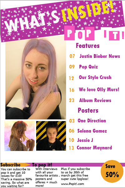
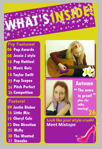
(Here is my double page spread article)
I
t’s difficult to believe last year this girl was working in a clothing boutique outside of London. Now she’s toured alongside Katy Perry, her first single ‘I Heart’ went straight to number one, her album is about to be revealed and she’s nominated for a BRIT! We met up with Lucy, style icon and rumoured girlfriend to Conor Maynard to find out how she’s finding her pop style lifestyle… and what it’s like hanging out with the stars.

She’s got a huge fan base. With 1.1 million followers on Twitter, 300,000 YouTube subscribers and 1.2 million fans on Facebook. Her tour has completely sold out and her launched clothing rage for H&M saw dedicated fans queuing outside their stores in the hope to pick up a pair of her famous Lucy Lu Shoes.

At just 16, Lucy was spotted by record label producer scooter Braun while he was browsing videos on YouTube. Lucy sat in her college canteen singing an acoustic version of Carley Rae Jepson’s ‘Call Me Maybe’ had gathered 300,000+ views in just 3 days! A few phone calls with producers and directors, meeting a few big names on the way, Tulisa, Jessie J and One Direction to name a few and the rest is History.

Lucy walks in rocking jeans and a Tee. “This is my casual look. I didn’t fancy getting all dressed up today. I’d wear joggers but I don’t fancy seeing myself in the fashion police section.”

Q: Hey Lucy how you doing?

A: Good thanks. An early start this morning for the photo shoot but you had coffee so it’s all good.

Q: Haha! Congratulations on your number one! What did you do to celebrate?

A: Just had some friends round. We were listening to the radio. I was so nervous but it was great to hear such good news. I feel like going straight to number one has set my standard. I’m serious about this industry and the music I make for my fans.

Q: Your album ‘Kiss’ is released next week. How do you think the fans will react to the album?

A: The album is really just about having a great time. I hope it makes them happy and want to enjoy the things they have. The music is all upbeat and fun. My favourite track I recorded was ‘I was made for you’, it’s about really liking that one someone so I hope that it will really connect to my fans.

Q: That’s cute. You have a huge fan base. What is it like having people scream your name everywhere you go?

A: For me I could never get used to fame. You’d be crazy if you did. I love that my fans listen to my music and send me adorable messages every day on Twitter. It really makes my day. Fame isn’t easy though. I find it difficult to cope with the paparazzi sometimes. I just went to meet up with a friend to get some coffee and there where paps following me everywhere. What would the headline be to that? “Woman buys Coffee”. I don’t understand why people are so interested in what I do sometimes.

Q: It must be very difficult. So there have been rumours about you and Conor Maynard being an item. Care to comment?

A: I knew I’d get asked that. He’s a great guy and he understands me since we’re both so young and in the music industry but we’re just friends. It is weird thinking of him as anything else than a friend.

Q: Fair enough. Our fans will be glad to hear he’s single. Is there any artist you’d like to duet with?

A: I’d love Usher or Neyo to rap in the middle 8 of one of my songs. I’d also love to do a pop Duet with Carley Rae Jepsen; I reckon it would be a great song. I’ve also been working with Katy Perry at the moment, we’re about to release a song but I can’t tell you much about that right now.

Q: The future sounds good! In your music video for ‘I heart’ we see you get covered in a pink goo. What was that like?

A: It was so fun! I thought at first it would be totally gross and I dipped my finger in and it was freezing, but it turned out to be a laugh. In mid shot I slipped and fell over on the ground which was really embarrassing. It wasn’t surprising since my costumes artist out me in 6” heels.  However by the end of the shoot me and the crew had a massive goo fight which was really fun.

Q: That does sound fun! So Lady Gaga openly said in an interview she thinks your single is boring and nothing new! Anything to reply?

A: I wouldn’t take any of her opinions seriously. She wears dresses made of meat.

Q: Okay so here’s the final question we ask at the end of every interview. What clothes, film and track are you loving?

A: hmmm. I love the film Bridesmaids, it’s hilarious.  Clothes, cute winter boots; they keep my feet warm and keep me stylish. And track? It’s got to be Jessie J’s new song Domino. It’s dead catchy; I was listening to it on my IPod on the way this morning.

Thank You so much for your time Lucy!

Don’t forget you can buy Lucy’s album’ Kiss’ from 14th February.


Thursday 7 February 2013

3 contents Pages...


I have looked at these contents pages and decided I want to completely re draft. I want text to be on the right and side of the page. I want the page number of the main feature to look more effective. I also will have a lower mast at the bottom. I think all 3 of these contents pages work well together because theyonly have one collum. They stick to 3 colours and are mainly white. The 1st and 3rd image only have 2 images on the page and I think that this works well.

Contents Page background colour change!

So I've made some changes to my contents page as to me it doesn't look right. I've started by testing different colour for a background and came to the conclusion that orange is the best colour. As I am currently working on my Double Page Spread in lesson, and my contents in my extra time I am going to focus on the Double page spread for now and work on the contents page later on.

Double Page Spread Draft 2

This is another draft for my double page spread. I am worried that this might look a little bit boring however if done correctly I think it could look quite effective. I think that the mast head is the right size however think if I where to set this as a template fro my double page spread properly it could look a little bare.

Double Page Spread Draft

I have had some issues with photoshop, and so there is still a white background around Lucy. I will make some changes so that there is no white background around her. Also I will make the image much bigger. I like the dropcap, although I might make some changes later on to make it look more professional. I like text and how it is set out. I have chosen to use seperate colours for colour and question. I am also goign to do some testing on pluggs and mastheads to add to the Double Page Spread.

Thursday 31 January 2013

POP IT! Website :)

The pop it! Website
Here is a draft of the web page for my music magazine. I have features Lucy on the front and the logo. The website is important for any magazine as it's a way of connecting with its readers as well as boosting sales.

I used the other 2 websites as inspiration. I realised it's important to have lots of images. And also to use bright and different colours. My website has no advertisements because they are annoying :)

Double Page spread finding

I like the layout of this Double Page Spread. I think it's quite different to other double page spreads and it's heavy in text but I think it works. If I wanted to recreate this I would have to take some Full Length shots which would mean a Re Shoot.

Wednesday 30 January 2013

Analysising my contents page..

I haven't finished my contents page yet and I would like to make some more changes later on.

Thursday 24 January 2013

Contents page draft

I am working on my contents page. I am testing different things to put into the bottom right of the page.